.png)
Crafting a Dynamic Animated Route Map of Portugal: A GIS Journey Animated Route Map | GIS Visualization | QGIS Animation
- AGSRT2019

- Apr 6, 2024
- 3 min read
Updated: Sep 19, 2024
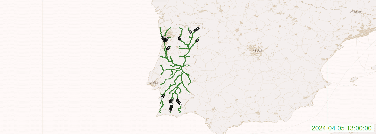
In the realm of geospatial analysis, dynamic visualizations not only inform but also enchant. My recent project, the creation of an animated route map for Portugal, exemplifies the fusion of data, technology, and creativity. This blog post narrates the journey from concept to final animation, revealing the techniques and tools behind the captivating GIF you see above.
The Genesis of Animation
The inspiration for this project was to offer a vivid depiction of movement across Portugal's diverse landscape. The goal was to transcend static maps by showcasing temporal changes, revealing the hidden dance of transit in one of Europe's most historic nations.
Toolset: QGIS Meets Python and GraphHopper
The orchestration of this animation required a symphony of software, each playing a vital role:
QGIS: Our maestro, an open-source GIS platform, laid the foundation for visualizing and animating the spatial data.
Python: This versatile scripting language, acted as the composer, scripting interactions with data and tools.
GraphHopper: A robust routing engine that calculated our routes, becoming the underlying melody of our map.
GraphHopper's Role in Data Generation
GraphHopper was instrumental in delineating routes using geographic coordinates across Portugal. With Python scripting the API calls, we created a seamless process to generate a multitude of GPX files, each representing a unique route that would later be visualized on the map.
Python: The Scripting Maestro
Python scripts were utilized to:
Interact with GraphHopper: Scripting API calls to generate detailed routes.
Automate Data Handling: Reading coordinates and managing GPX file outputs.
Format Time Data: Ensuring the time stamps were consistent and formatted correctly, essential for accurate temporal mapping.
QGIS and TimeManager: Visual Choreographers
With GPX files ready, QGIS stepped into the limelight, with the TimeManager plugin directing the temporal settings. Each route was animated over time, displaying a vibrant representation of Portugal's routes as they come alive throughout the day.
The Final Act: A GIF Animation
The product of this meticulous process was a GIF animation that allows us to witness the ebbs and flows of transit over time. Each green line represents a path taken, and the accompanying timestamps offer a glimpse into the rhythm of travel throughout the country.
Why This Matters
Animated route maps serve as powerful tools across various domains:
Urban Planning: Unveiling traffic flows and congestion for better city planning.
Tourism: Showcasing scenic routes and tourist circuits.
Education: Serving as a dynamic teaching aid for geography and history.
Environment: Understanding the impact of routes on ecological balance.
The Journey Continues
This animation is but a snapshot of possibilities. Future endeavors may incorporate real-time data, explore new regions, or delve deeper into multi-modal transportation analyses.
In closing, this GIS journey through Portugal has not only produced an enlightening visualization but also reinforced the value of integrating disparate tools to tell compelling spatial stories. It's a testimony to the power of GIS in transforming raw data into an informative and visually arresting narrative.
Let this animation be both a window into Portugal and an inspiration for the geospatial stories you wish to tell. Whether you're a professional cartographer, urban planner, or just a map enthusiast, the tools and processes described here open a world of opportunities for exploration and discovery.
Animated Route Map | GIS Visualization | QGIS Animation


Comments